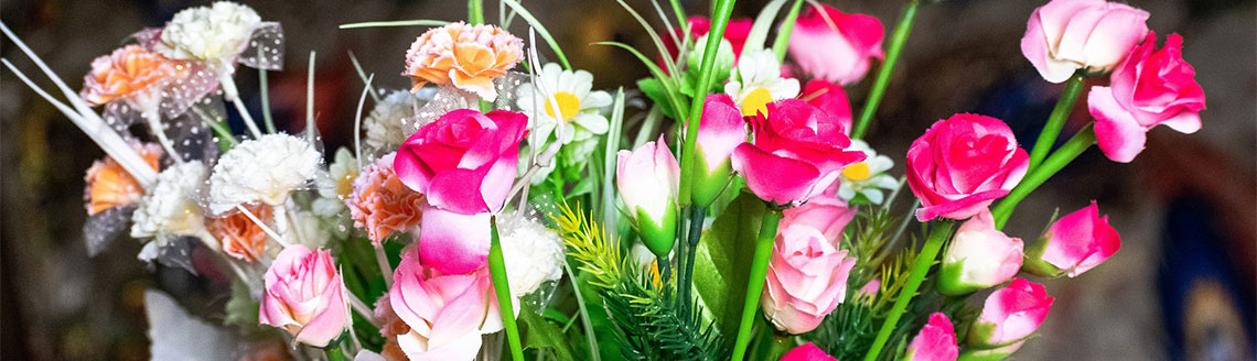
Your front door is the first thing visitors notice, and a pair of well-chosen hanging baskets either side can transform an ordinary entrance into something genuinely welcoming. The trick lies in matching your baskets to the colour of your door, so the whole display feels intentional rather than accidental. Artificial hanging baskets make this easier than you might expect, because you have complete control over the colours from the very start, and they stay looking exactly the same all year round.
In this guide we’ll walk through practical colour pairings for the most common front door colours, along with a few styling tips to help everything look balanced and natural.
Why colour matching matters
A hanging basket that clashes with your door can make a lovely home feel a little jarring, while one that blends too closely can disappear altogether. The aim is harmony with a touch of contrast, so the flowers stand out without fighting the colour behind them.
With artificial hanging baskets you get a real advantage here. Fresh flowers fade, droop and change as the season moves on, so the careful colour scheme you planted in May rarely survives until September. A good quality faux display holds its colour and shape day after day, which means the pairing you choose stays true for years rather than weeks.
It’s worth remembering, too, that artificial baskets ask nothing of you in return. There’s no daily watering in the height of summer, no deadheading and no disappointment when a heatwave or a cold snap takes its toll. For shaded porches where real flowers struggle, or for busy households who simply don’t have time for upkeep, they’re a sensible and good-looking solution.
Matching artificial hanging baskets to your front door colour
Below are practical pairings for the most popular door colours. Treat these as a starting point rather than strict rules, and always step back to view the display from a distance, the way a visitor approaching your home would see it.
Black doors
Black is bold and timeless, and it gives you a wonderful blank canvas. Because the door is so dark, almost any colour will pop against it, so you can afford to be a little more adventurous.
- White and cream flowers look crisp and elegant against black, perfect for a classic or period property.
- Hot pinks, deep purples and rich reds create a striking, confident contrast.
- For something softer, try a mix of lavender and trailing ivy for a relaxed, natural feel.
Whatever you choose, plenty of green foliage helps soften the strong contrast so the display doesn’t feel too stark.
White doors
A white door is the most forgiving of all, sitting happily alongside nearly any colour palette. This is your chance to add the brightness that the door itself doesn’t provide.
- Reds, oranges and warm yellows bring real cheer and stand out beautifully.
- Soft blues and purples create a calm, cottage-garden look.
- Mixed pastels feel gentle and pretty without overwhelming the entrance.
If your white door has a lot of glass or detailing, a fuller basket with generous trailing foliage will frame it nicely.
Sage green doors
Sage has become hugely popular, and its muted, earthy quality pairs effortlessly with natural, garden-inspired displays. The key is to complement that soft tone rather than compete with it.
- Blush pinks and creams feel romantic and understated against sage.
- Lavender and white work together for a calm, herbal look that suits the green beautifully.
- Deep plum or burgundy adds depth and a touch of drama if you want more contrast.
Avoid anything too neon, as bright artificial-looking colours can clash with sage’s gentle character.
Navy doors
Navy is smart, traditional and a little more relaxed than black, while still offering excellent contrast. It flatters both bright and soft palettes.
- White and pale yellow look fresh and nautical against navy.
- Warm pinks and corals add a lovely pop of life.
- Soft oranges and apricots feel surprisingly elegant and warm.
Navy and white is a particularly reliable combination if you want something that always looks tidy and considered.
Red doors
A red door is already a statement, so the goal here is usually to support it rather than add more bold colour. Too many competing brights can quickly feel busy.
- White and cream flowers calm things down and let the door take centre stage.
- Greenery-led baskets with plenty of ivy, ferns and trailing foliage look natural and unfussy.
- Soft yellows can work if you want a little warmth without overpowering the red.
As a rule, steer clear of pinks and oranges next to a red door, as the tones often sit awkwardly together.
Grey doors
Grey is a modern, versatile choice that behaves a little like a neutral. Lighter greys lean towards soft pairings, while darker greys can handle bolder colours much like black.
- Yellows and whites brighten up a grey entrance and stop it feeling cold.
- Purples and lavenders complement cooler grey tones beautifully.
- Blush pink and dusty rose create a contemporary, understated look.
If your grey has a warm, almost greige tone, lean towards creams and soft pinks. For a cooler, slate grey, blues and purples sing.
Oak and natural wood doors
Timber doors bring warmth and texture, so the most successful pairings tend to echo that natural, organic feel. Earthy and warm tones generally work better than cool ones.
- Warm oranges, deep reds and golden yellows feel autumnal and rich.
- Cream and soft white keep things light and let the grain of the wood show.
- Plenty of mixed greenery suits the natural look and never feels out of place.
Oak and wood doors particularly suit a foliage-led basket, where the flowers are accents rather than the whole show.
Pastel doors
Pastel doors, whether duck-egg blue, soft pink or pale green, already carry a delicate colour, so the safest approach is to keep the basket gentle too.
- Whites and creams sit beautifully beside any pastel without overwhelming it.
- Tonal pairings work well, such as soft pink flowers with a pale pink door.
- Lots of green foliage helps anchor the softness and stops the whole effect looking washed out.
The one thing to avoid is a clashing bright, which can make a pretty pastel door feel cheap rather than charming.
Keep your colour palette simple
However tempting it is to include every flower you love, the most realistic and elegant displays tend to stick to around two or three main colours with variations in tone throughout. This is one of the most consistent pieces of advice across the world of hanging baskets, and it holds true for both real and artificial displays.
A useful approach is to choose one main flower colour, one supporting shade and then plenty of green foliage to tie it together. Trailing ivy, small ferns and textural greenery give the basket a sense of natural movement and depth, and they stop the arrangement looking flat or overly uniform.
Don’t forget size and proportion
Colour is only half the story. A basket that’s the wrong size for your entrance will look off no matter how well you’ve matched the tones. Traditional hanging baskets generally come in around 12, 14 and 16 inch diameters, so think about the scale of your door and the space around it.
A grand double door or a tall porch can carry larger baskets comfortably, while a smaller terraced entrance is usually better served by something more modest. Always check there’s enough clearance so you’re not ducking around the baskets every time you come and go.
A matching pair either side of the door almost always looks more deliberate and balanced than a single basket on its own, so it’s worth planning for two from the outset.
A note on outdoor conditions
Artificial hanging baskets are wonderfully low maintenance, but it’s worth being realistic about outdoor life. Prolonged exposure to strong sunlight can cause some artificial flowers to fade over time, so if your baskets will hang in a bright, south-facing spot, look specifically for displays described as UV resistant and check the product description confirms they’re suitable for outdoor use.
In very exposed positions, it’s sensible to bring baskets in during severe storms with strong winds. A sheltered porch or recessed doorway will always be kinder to your display than an open, weather-beaten wall.
Simple care to keep them looking their best
One of the great joys of artificial baskets is how little they ask of you, but a small amount of occasional care goes a long way:
- Give them a gentle dust with a soft cloth every few weeks to keep the colours fresh.
- For outdoor baskets, a light rinse with water now and then helps shift any build-up of dust or grime.
- If you swap your baskets seasonally, store the spares somewhere cool and dry to protect their shape and colour.
With this minimal effort, a well-made artificial hanging basket can stay looking lovely year after year.
Bringing it all together
Matching your hanging baskets to your front door colour is really about creating a sense of harmony, so your entrance feels considered and welcoming from the moment someone arrives. Black and white doors give you freedom to be bold, sage and pastels reward a softer touch, navy and grey suit both fresh and gentle palettes, while red and natural wood doors look best with foliage-led, understated displays.
Keep your colours limited, choose a size that fits your space, plump for UV-resistant options if you’re hanging in full sun, and you’ll have a display that stays beautiful through every season. With artificial hanging baskets, the look you plan today is the look you’ll still enjoy long into the future, with none of the watering, fading or fuss that comes with the real thing.
 A warm welcome from The Artificial Flowers Company. We offer artificial flower arrangements, silk flowers, hanging baskets, topiary balls, topiary plants and much more - we hope you find what you're looking for!